Enhancing User Experience for Fitch Learning and UBS
Background
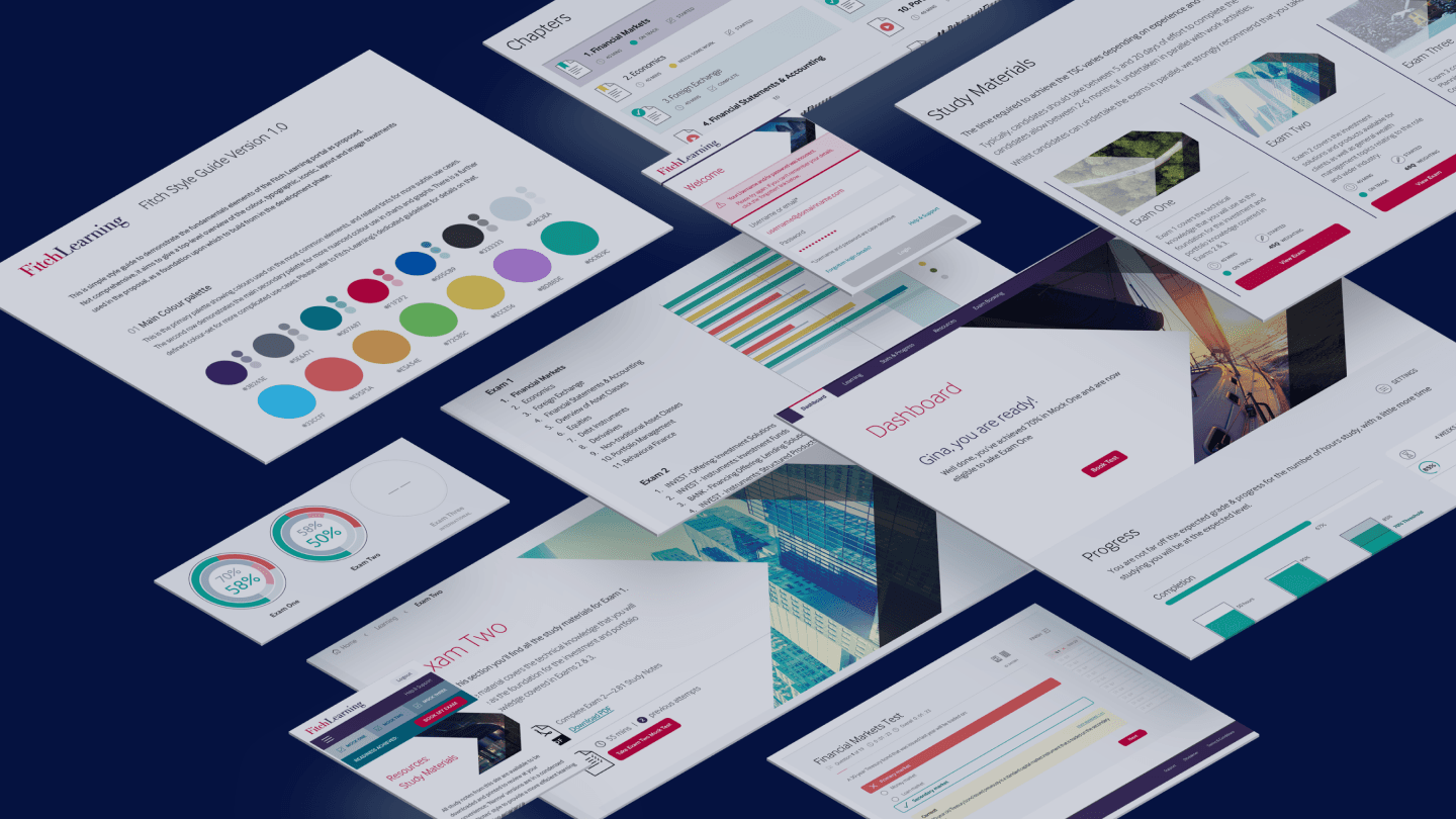
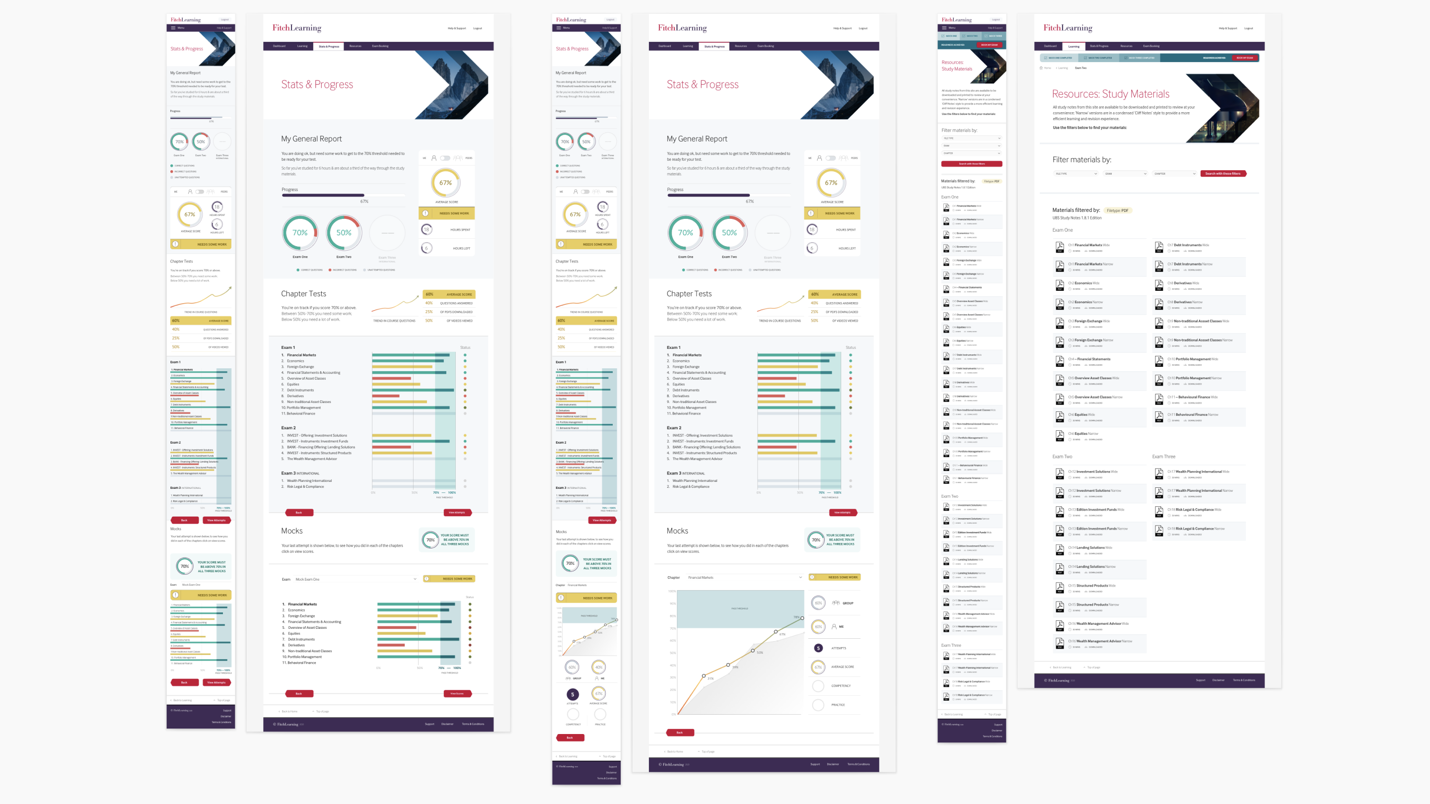
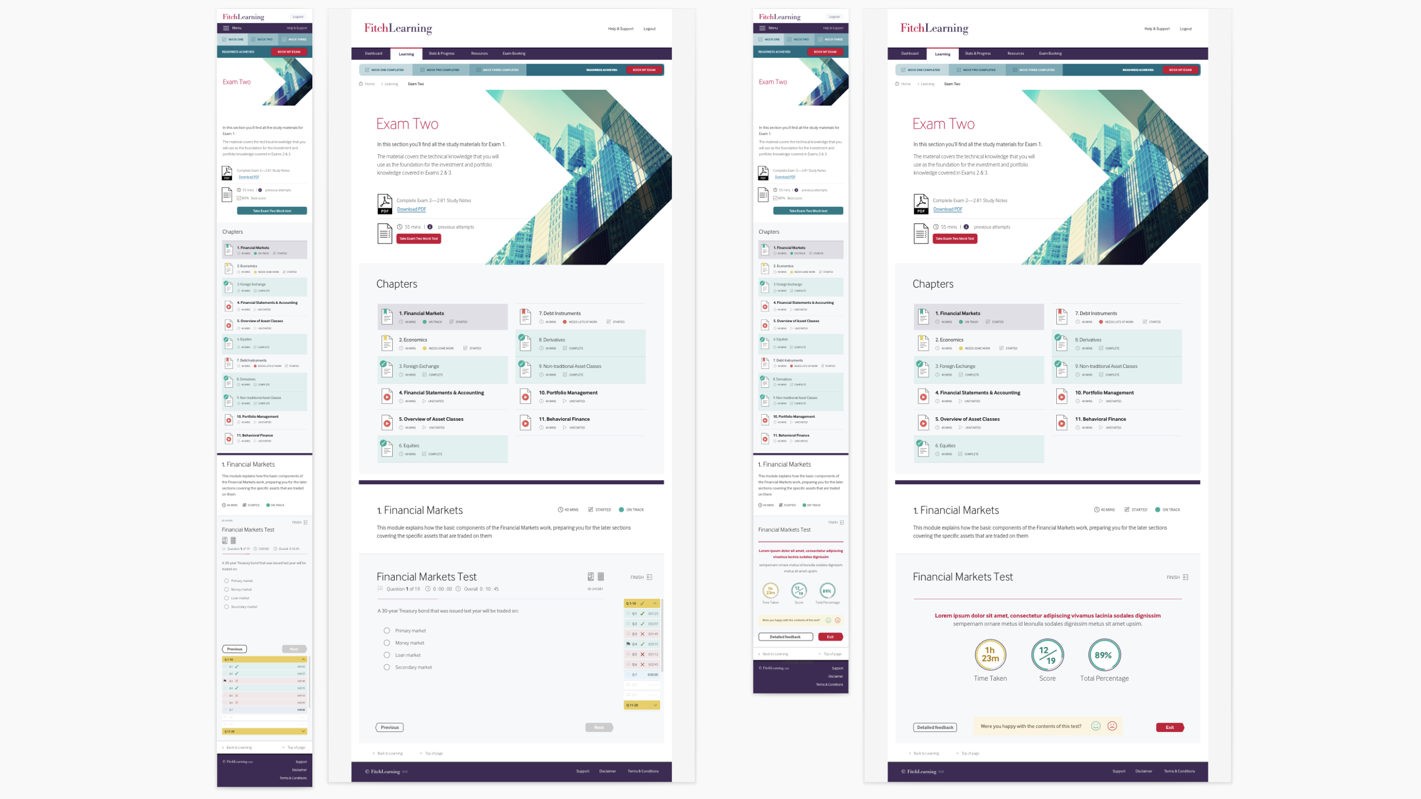
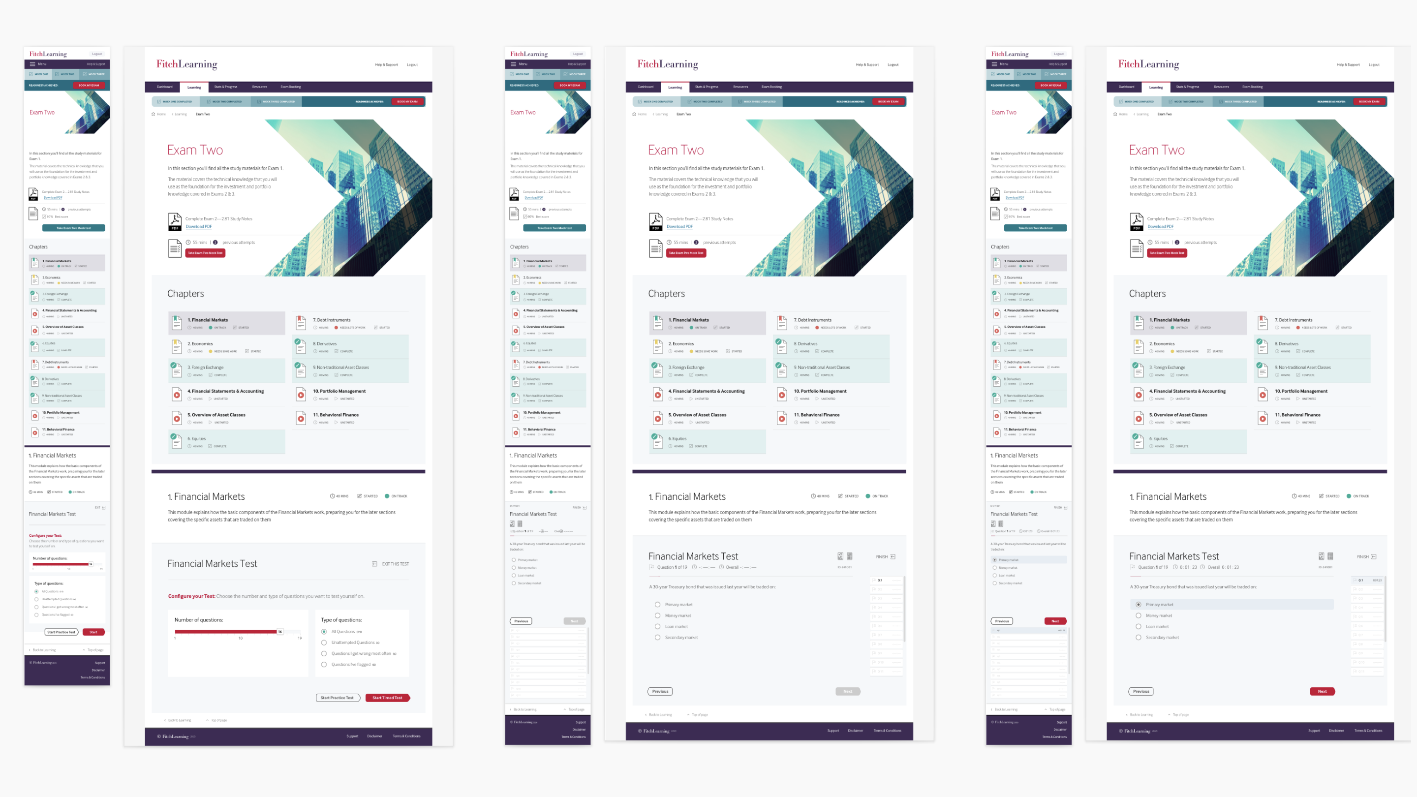
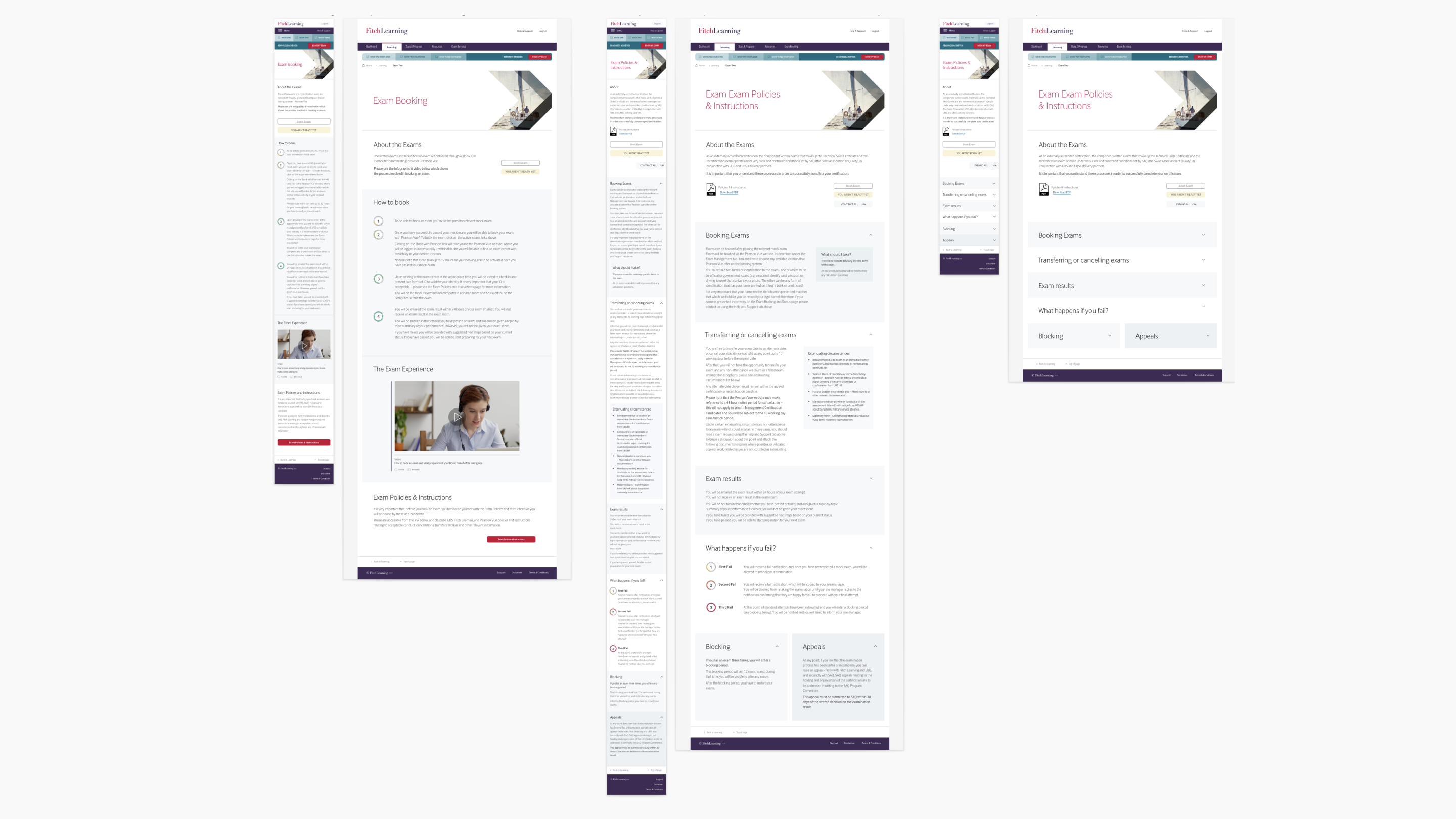
Fitch Learning approached us to revamp the CWMA (Certified Wealth Management Advisor) platform, aiming to improve its information architecture, user experience, and design. The platform serves as a critical tool for delivering wealth management accreditation, branded for both Fitch and UBS. Our objective was to make the platform intuitive, efficient, and engaging, ensuring that key content stood out and the learning experience was both encouraging and enjoyable.
Our Approach
We began by conducting thorough research and stakeholder interviews to understand the needs and pain points of users. This informed our recommendations and set the stage for the design phase. Through collaborative design sprints, we developed moodboards and concepts, iterating on the look and feel to align with both Fitch and UBS branding. Our deliverables included:
- Comprehensive research and stakeholder interviews
- Detailed recommendations including revised Information Architecture
- Moodboards and concept development
- Iterative design processes
- Design sprints to rapidly prototype solutions
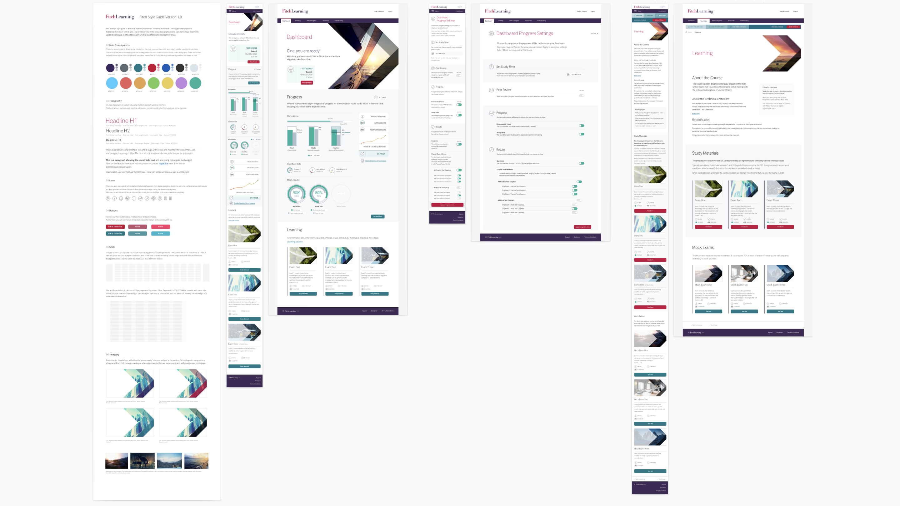
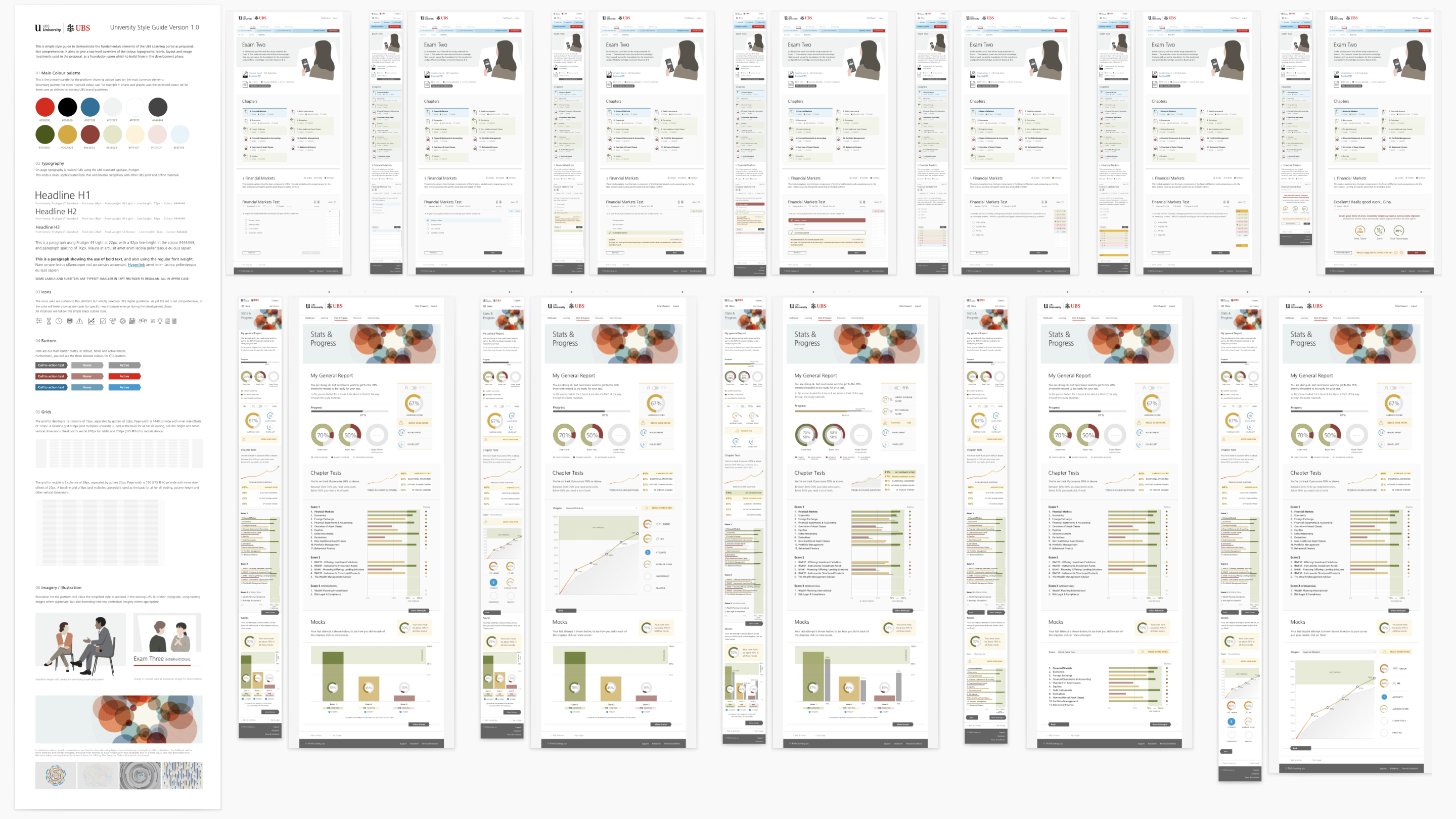
- Creation of a unified design system for both Fitch and UBS platforms
- Front-end HTML realisation ready for integration with Fitch's technical architecture and backend systems
The Outcome
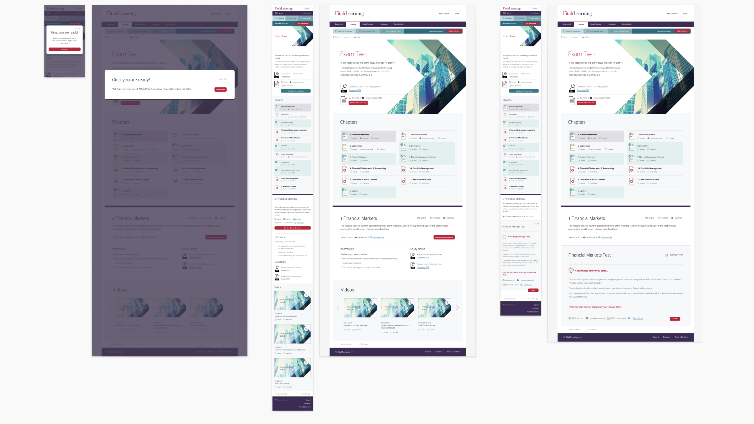
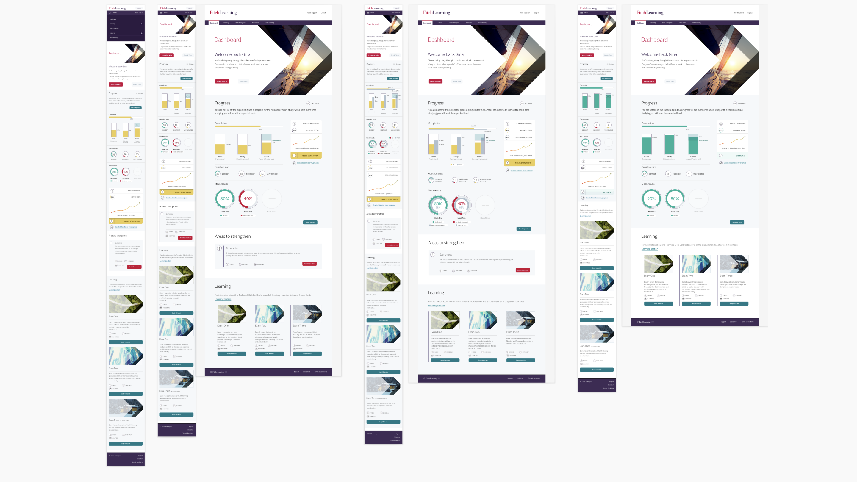
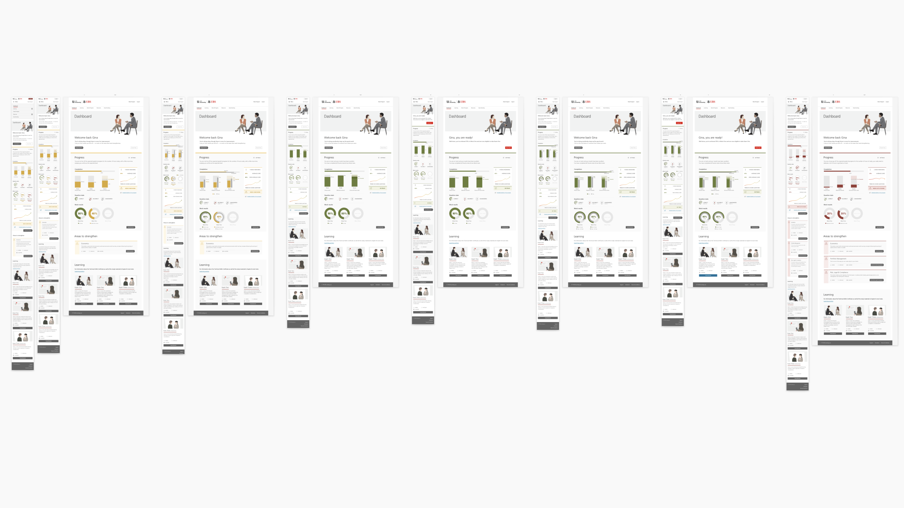
Our redesign significantly enhanced the user experience of the CWMA platform, making it more intuitive and engaging for learners. The improved design facilitated easier navigation and better content accessibility, contributing to a more effective learning process. While specific user engagement statistics are proprietary, the platform's enhancements align with Fitch Learning's commitment to delivering high-quality, scalable learning solutions.

